Raiil is a Pharma and biotech SaaS startup
They had skillfully crafted feature designs and mockups to present to potential investors, yet they encountered difficulties in transforming those mockups into tangible development outputs.
The conducted research was rather limited, and much of the work and feature prioritization hinged on assumptions. This approach introduced a significant degree of risk to the project.
Overview
UX Research
UI Design
Product Design
goals
Collaborating with a team of product and visual designers, our project aimed to develop a web app from the ground up.
Our objectives included:
– Identifying urgent user needs for effective feature prioritization
– Reevaluating and validating previous assumptions.
– Designing a revamped style and UI Kit with a focus on accessibility and usability.
– Constructing a core feature for implementation alongside essential interface screens.
Research
We set out on an exciting journey to explore the world of reporting by conducting 10 exploratory interviews. Our goal was to understand the challenges and successes users experienced while creating reports in their daily work lives.
hypotheses
Our investigation was based on three hypotheses: the reporting process can be overwhelming due to the use of multiple software tools; gathering all the data generated during the process can be quite a challenge; and dealing with different file types can be tricky.
Questions
To dig deeper, we asked questions about the users’ job context, daily tasks, and team configurations. We also wanted to know which tools they used and how they felt about using them, as well as their reporting process.
INSIGHTS
The analysis of the research confirmed our suspitions: the software currently in use is too complex for everyday tasks. Aside from this, users need a simple way to take notes, store them, and find them easily.
They also pointed out a better way of organizing research data was necessary. This is challenging, specially after finding out that although reports have similar structures, small differences can occur depending on the company or project lead.
definition
Given the vast scope of the process and taking into account our resources and deadlines, we realized the need to concentrate on a particular aspect of the user journey in order to maximize value.
We found ourselves at a crossroads after analyzing user feedback, thinking whether to prioritize “Research” or “Reporting.” In the end, we opted to focus on reporting, as its high value, combined with the convenience of using open-source document builders, made it the easiest user need to pursue and subsequently monetizing.
Moreover, centering the product around this core feature will not only make its development more feasible but also streamline the process of enhancing value in the long run.
Ideation
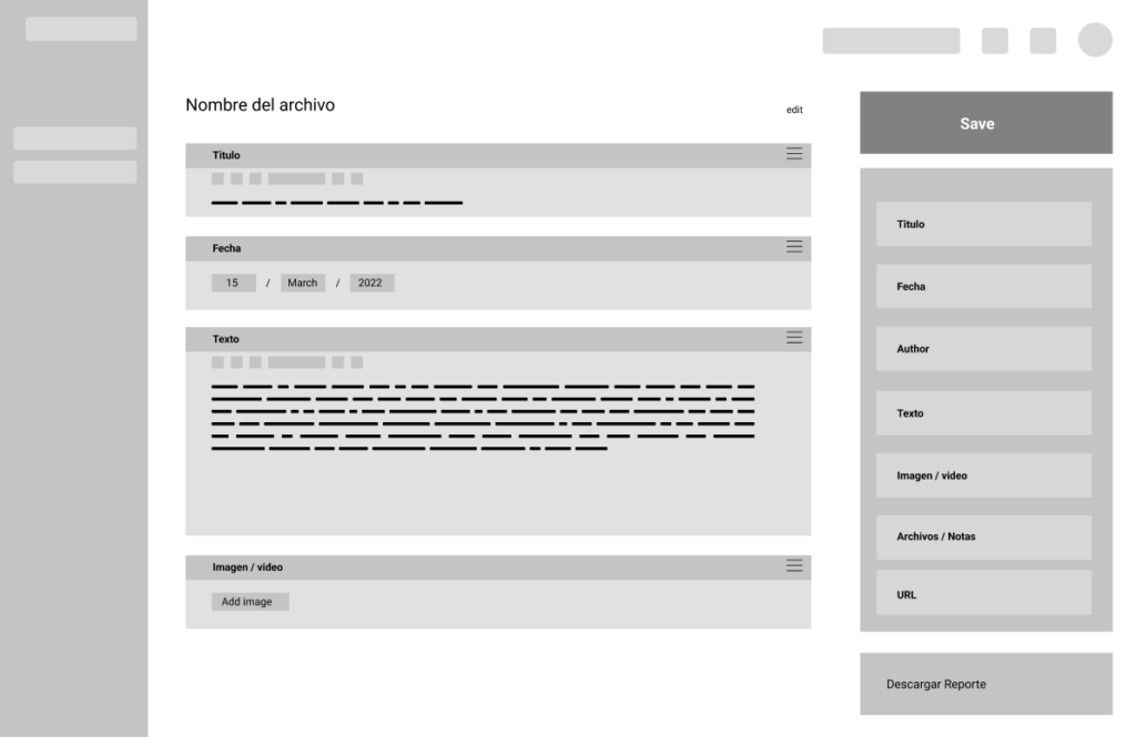
We initiated the process by brainstorming potential screen designs and creating low-fidelity wireframes. As previously noted, the nature of reports can vary based on the workplace, making customizability a top priority for us. Following concept testing and in-depth discussions with fellow designers and key stakeholders, we concluded that our chosen low-fidelity wireframe was on the right track for addressing this concern.
With the initial step completed, we moved on to exploring multiple concepts for presenting the design to users, allowing us to test and refine our understanding of what worked and what didn’t. This exploration led us to develop three distinct mid-fidelity wireframes, each offering a unique approach to address user needs.

Upon engaging with our users and conducting usability tests, we gathered a wealth of insightful feedback. Some key takeaways included users’ preference for a draggable layout on the left with comments on the right, due to their frustration with floating comments obstructing the view, and the lack of clarity in the call-to-action for downloading the report.
Taking all of this feedback into account, along with some additional input, we set out to create our high-fidelity screen design that embodies these user-driven improvements and refinements.
Final Designs
Upon engaging with our users and conducting usability tests, we gathered a wealth of insightful feedback. Some key takeaways included users’ preference for a draggable layout on the left with comments on the right, due to their frustration with floating comments obstructing the view, and the lack of clarity in the call-to-action for downloading the report.
Taking all of this feedback into account, along with some additional input, we set out to create our high-fidelity screen design that embodies these user-driven improvements and refinements.
NEXT STEPS
As the solution and feature gets further develop, it’s recommended that additional usability testing is performed, investigating the data-gathering process to ensure a complete user journey that takes into account edge cases we couldn’t consider on this project, enhancing the feature’s value.
Designers
Angel Saavedra, Alessio Devanna, Marta Agulló, Claudia Díaz